Artist statement:
As a body of work, the commonality between these pieces is a strong focus on emotion. In everything I create, the primary focus is to impart something I hope a portion of my audience has never felt, which often manifests in me trying to depict my own views on life. My knack for minute detail often pushes me towards mediums I have a more tangible and functioning hold over, such as pen, colored pencil, and charcoal, all of which are the closest to my native pencil. I tend to focus heavily on composition; I’ll spend a large majority of my time repeatedly trying to cobble together an image which I am happy with, often scrapping entire ideas which I had been attached to because I can’t manage to balance the final picture. I focus so heavily on these aspects because my primary focus is always conveying the exact message I want to, with as little deviations from what I’m feeling as I can achieve. The most interesting element of art as I understand it is how effectively it can bridge gaps between mediums, so in my mind, everything has to be deliberate. I think good art can be thought about and deconstructed, but it doesn’t have to. Everything an artist wants you to know should be imparted just by looking.
Nouveau |

Vienna |
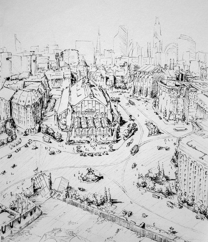
These two are essentially similar scenes depicted in the same medium, one striving for realism and the other not. Both roughly try to build a Central European city around the 1910s-30s, which is heavily inspired by sections of “A Farewell to arms” in which the main character spends time in Northern Italy. I chose this setting as I wanted to draw existential dread, and I see this time and place as an approximation of this, considering the uncertainty of the region following the First World War. “Nouveau” was done with the intention of making every line explicit and deliberate, while large sections of “Vienna” were completed without me looking at the paper, or with my eyes shut entirely.
Sitting
|
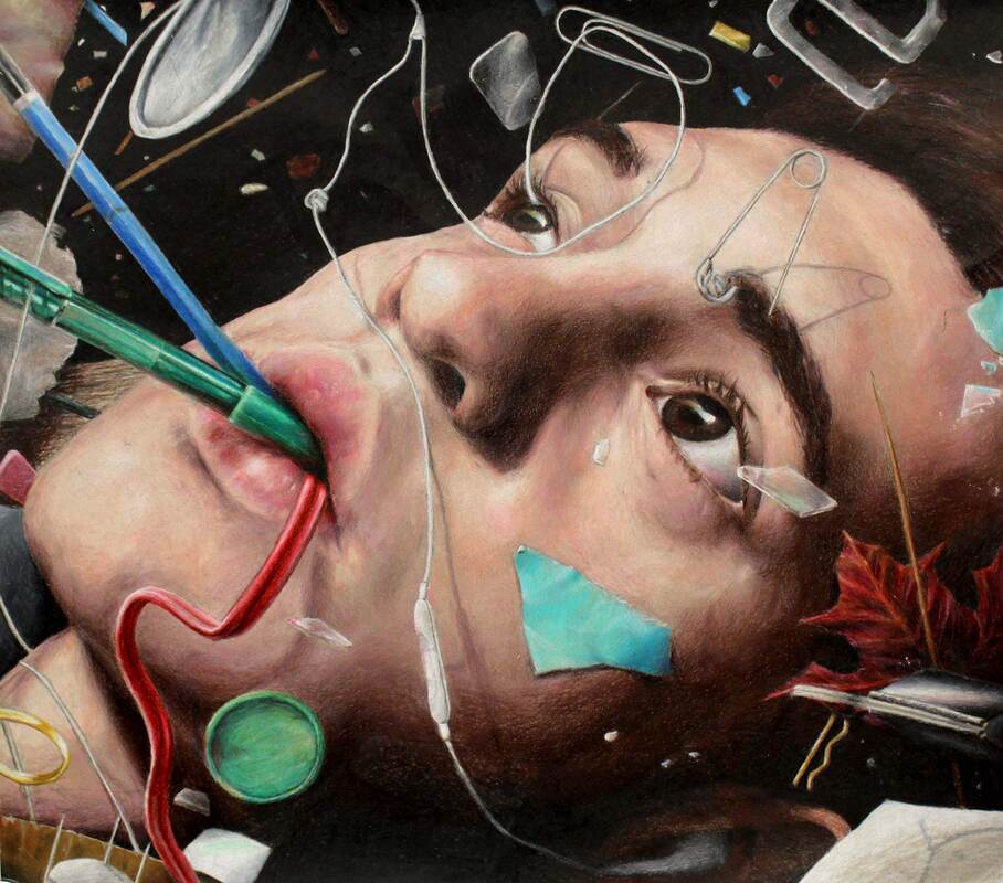
This work stems from the guidelines of a surreal self portrait and therefore gave me moderate freedom to see what I could achieve compositionally. Although looking back from a few months on I have a fair score of disagreements with it, in November 2019 I found this work an acceptable approximation of myself, so by consequence I’d imagine it an accurate representation of what I was seeing at the time. The work is composed of colored pencil on a grey paper, as I wanted much of it to be in shadow, as if the subject were submerged or in an area of dense atmosphere. I’ve named it “Sitting” to connect that this may be a depiction of how it feels to be sitting, even if the subject is probably doing something closer to floating in the scene itself.
|
Self Portrait in charcoal

Again the result of a prompt, this time a staple of the art 4 curriculum; a self portrait in charcoal. Within the parameters I wanted, in my true fashion, to make the final result marginally absurd, but still impressive to look at from a technical standpoint. After a series of a few unorthodox and distasteful alternatives I settled on this slouched position because I felt it was an apt representation of myself in somewhere around a fifth of my existence. Apart from this departure, this piece remains very technically based, only with the added hope of provoking an emotion of more interest in the audience through positioning. My use of charcoal revolved around broad strokes and focuses’ on value as the work is on the large side and does not require fine detail to impart its point.
Holiday card
|
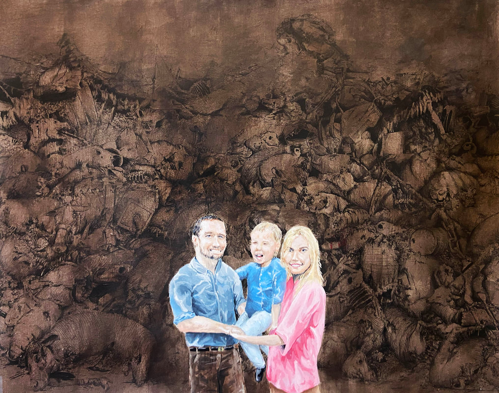
This big mess is the result of a prompt asking for us to address a contemporary issue in any style we wanted. The result on my end, at least in my mind, is an approximation or how I view a few sets of current happenings. It addresses what human nature means in the context of today, and has a specific focus on egotism and willful ignorance. I used pen, acrylic and watercolor paint to achieve its desired effect, first covering the background in an expanse of loose pen work, which I then washed over with watercolor to obscure it from view. The family in the middle is done in acrylic paint, and strives to be more realistic than its surroundings.
|
Cormac Ganshirt 2020:

|

|

|

|
|
I hope as a viewer you can find something to take away from any of my works; I love to hear feedback as much as I can. Art is in its nature often selfish, so I thank you for taking the time to consider my creations.
